Conditional formatting in Power BI is a powerful feature that allows users to visually emphasize data based on specific conditions, making reports and dashboards more interactive and insightful. By highlighting trends, exceptions, or key metrics, conditional formatting transforms raw data into actionable information. Users can apply colors, data bars, and icons to tables, matrices, and charts, helping stakeholders quickly identify patterns or anomalies. Whether you are analyzing sales performance, financial data, or customer behavior, understanding how to effectively implement conditional formatting can greatly enhance the clarity and impact of your Power BI reports.
Understanding Conditional Formatting in Power BI
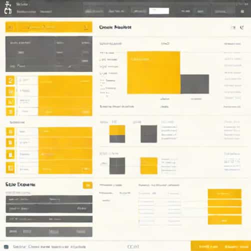
Conditional formatting in Power BI works by applying visual cues to data elements based on defined rules or thresholds. This feature is available across various visualizations, including tables, matrices, and charts. The main objective is to draw attention to significant data points, making interpretation faster and more intuitive. Power BI allows you to base formatting on values within the data, on rules you define, or even on advanced formulas created using DAX (Data Analysis Expressions).
Types of Conditional Formatting
Power BI offers several types of conditional formatting that cater to different analytical needs. These options give users flexibility in how they present and emphasize their data.
- Color FormattingThis allows you to change the background or font color of a cell or data point based on its value. For example, sales figures above a certain threshold can be highlighted in green, while those below a target can appear in red.
- Data BarsData bars provide a visual representation of value magnitude directly in table cells. Longer bars indicate higher values, making comparisons easy without examining numbers in detail.
- IconsPower BI lets you add icons such as arrows, checkmarks, or flags to represent data conditions. These icons provide quick visual cues about trends or thresholds being met.
- Field Value FormattingUsers can apply formatting based on another field’s value, enabling dynamic and context-sensitive visualization. This is particularly useful when one metric affects the display of another.
Applying Conditional Formatting
Applying conditional formatting in Power BI is straightforward but requires understanding the logic behind your rules. To begin, select the visual you want to format, navigate to the formatting pane, and choose the conditional formatting option appropriate for your data type. Power BI provides both basic and advanced options, allowing you to use predefined color scales, rules, or custom expressions.
Step-by-Step Guide
- Select a table, matrix, or chart visual.
- Click on the format section in the visual pane.
- Choose the type of formatting, such as background color, font color, or data bars.
- Define the rules by specifying value ranges or using DAX expressions for dynamic logic.
- Preview the formatting to ensure it aligns with your analytical goals.
- Apply and save the changes to see the conditional formatting in effect.
Using Rules and Thresholds
Conditional formatting often relies on rules or thresholds to determine how data should be highlighted. You can set static thresholds, like marking all sales above $10,000 in green, or use relative thresholds that adjust based on the dataset’s maximum or minimum values. Advanced users can utilize DAX expressions to create more sophisticated conditions, such as formatting values based on the difference between current and previous periods, or comparing metrics across categories.
Practical Examples
- Highlighting top-performing products with a green background and underperforming ones in red.
- Applying data bars to revenue columns to visually compare month-over-month growth.
- Using icons to indicate whether targets were met, exceeded, or missed.
- Changing font colors in a sales matrix based on regions performing above or below average.
Conditional Formatting for Advanced Analytics
Beyond basic rules, Power BI allows conditional formatting to support advanced analytics. By integrating DAX, users can apply logic that takes multiple dimensions into account, making visualizations more intelligent. For instance, you can highlight customers who exceed a combination of purchase frequency and order value thresholds, or use color gradients to represent the intensity of data points across a heatmap. This capability turns conditional formatting into a strategic tool for decision-making rather than just a visual aid.
Dynamic Formatting with DAX
DAX-based conditional formatting allows users to create formulas that evaluate complex scenarios. For example, you can format a sales column based on the percentage difference from a target or dynamically adjust colors based on percentile ranks. This approach provides flexibility and ensures that your visuals respond intelligently to changes in the underlying data, offering real-time insights without manual updates.
Best Practices for Conditional Formatting
While conditional formatting can greatly improve the readability of Power BI reports, it is essential to apply it thoughtfully. Overusing colors, data bars, or icons can overwhelm users and obscure key insights. Effective conditional formatting highlights the most critical data without distracting from the overall message. Consistency in color schemes and formatting rules ensures users can easily interpret patterns across multiple visuals.
Tips for Effective Use
- Use a limited color palette to avoid confusion.
- Apply formatting to emphasize important metrics, not every data point.
- Combine visual cues with clear labels for context.
- Test rules on different datasets to ensure they provide meaningful insights.
- Document the logic behind complex DAX expressions for transparency.
Benefits of Conditional Formatting in Power BI
Conditional formatting enhances both the usability and the analytical value of Power BI reports. Users can quickly spot trends, outliers, and performance gaps without manually scanning data. It reduces cognitive load, making complex datasets easier to interpret for executives, analysts, and stakeholders. Additionally, conditional formatting supports data-driven decision-making by visually guiding attention to areas that require action, enabling faster and more informed responses.
Impact on Business Reporting
In corporate environments, conditional formatting in Power BI contributes to more effective reporting. Financial dashboards, sales analyses, and operational reports become more interactive and actionable. Decision-makers can instantly recognize underperforming regions, emerging trends, or areas exceeding targets. By visually representing the significance of data, conditional formatting makes reports not only informative but also compelling, ensuring that insights lead to timely and effective business decisions.
Conditional formatting in Power BI is an essential tool for turning raw data into meaningful insights. By using colors, data bars, icons, and dynamic DAX formulas, users can highlight key metrics, reveal trends, and make complex datasets more understandable. Applying conditional formatting thoughtfully enhances both the aesthetics and functionality of dashboards, helping stakeholders make faster and better-informed decisions. Whether for basic tables or advanced analytical models, mastering conditional formatting in Power BI is crucial for anyone looking to elevate their data visualization and reporting skills.
Overall, conditional formatting is not just a cosmetic feature; it is a strategic element in data analysis. When used effectively, it improves report clarity, enhances decision-making, and brings attention to what truly matters. Power BI users who leverage conditional formatting can provide richer, more actionable insights while maintaining an intuitive and professional look in their dashboards.